

A working KPI dashboard for SaaS answers one question fast: is this business getting healthier or not? That means MRR, ARR, and net revenue retention (NRR) on the top row, churn and CAC payback beneath them, and LTV:CAC and expansion revenue framing the unit economics underneath. The dashboard’s job isn’t to display numbers. It’s to act as a single source of truth that boards, investors, and your own leadership team trust without needing a Slack thread to interpret it.
If you’re building or rebuilding yours in 2026, the top row should carry core SaaS metrics including MRR and growth rates, ARR, revenue retention metrics, churn types, CAC and payback period, LTV:CAC ratio, ARPA, and expansion revenue shares.
Pro Tip: Before you touch dashboard design, reconcile your MRR to your billing system for the last 30 days. If the numbers don’t match what finance reports, no amount of good chart design will fix a trust problem.
Key Takeaways
A SaaS KPI dashboard only earns trust when its headline numbers reconcile to billing, carry clear RAG thresholds, and are owned by named people who act on them.
| Point | Details |
|---|---|
| Start with reconciled MRR | Tie MRR to billing before building anything else; it underpins every other metric on the dashboard. |
| Separate logo and revenue churn | Track both, since low logo churn can hide dangerous revenue churn from large accounts downgrading. |
| Use RAG thresholds on ratios | Apply green/amber/red bands to LTV:CAC, CAC payback, and Rule of 40 so a board scans status in seconds. |
| Assign an owner per KPI | Map each metric to a named role with a short playbook for common breaches, not just an alert. |
| Migrate off spreadsheets by scale | Plan the move from templates to governed BI before ARR crosses roughly £1 million to avoid reporting drift. |
Table of Contents
- What KPIs should a SaaS dashboard show?
- Which dashboard layout fits your team?
- How do you connect billing, CRM and analytics data?
- What benchmarks should you set for unit economics?
- How do you make dashboards actually get used?
- How do you build a board-ready executive dashboard?
- How does a fractional CFO make your dashboard investor-ready?
- Why most SaaS dashboards fail before they’re even built
- Frequently asked questions
- Sources
What KPIs should a SaaS dashboard show?
Getting the definitions right matters more than getting the visuals right. A dashboard built on inconsistent formulas will mislead a board faster than no dashboard at all.
Monthly Recurring Revenue (MRR) is the normalised monthly value of all active subscriptions. Annual Recurring Revenue (ARR) is simply MRR multiplied by 12, useful for board reporting but a poor granular management metric because it smooths out monthly volatility that actually matters operationally.
Net Revenue Retention (NRR) measures revenue from your existing customer base over a 12 month period, including expansion, contraction, and churn, but excluding new customers. Anything above 100% means your existing base is growing even before you sign a single new logo. Gross Revenue Retention (GRR) does the same calculation but excludes expansion, so it never exceeds 100% and shows you the pure retention floor.
Churn needs two flavours on your dashboard, not one: logo churn (the percentage of customers who leave) and revenue churn (the percentage of revenue lost). A business can have low logo churn and dangerous revenue churn if its biggest accounts are the ones downgrading.
Customer Acquisition Cost (CAC) is fully loaded sales and marketing spend divided by new customers acquired in the period. CAC payback period tells you how many months of gross margin it takes to recover that spend, and LTV:CAC compares lifetime value against acquisition cost as a single efficiency ratio.
Average Revenue Per Account (ARPA) and expansion revenue round out the top row, showing whether your growth is coming from new logos or from deepening existing relationships.
- Calculate MRR from your billing platform, not your CRM (CRM stages don’t equal invoiced revenue).
- Calculate churn on a rolling 30 day and 90 day basis, since a single bad month can distort the trend.
- Reconcile NRR and GRR against a defined cohort. A SaaS KPI dashboard centralising billing, CRM, and product analytics data avoids the classic error of pulling churn from one system and revenue from another.
- Set a RAG threshold for each metric so a viewer knows instantly whether a number needs attention, not just what it is.
The most common pitfall isn’t a wrong formula, it’s an inconsistent one. Finance calculates churn one way, the product team calculates it another, and by the time numbers reach the board deck nobody agrees on the base truth. A governed dashboard reconciles metrics back to billing and the finance system, so the number in the board pack matches what’s in the ledger. If you want the formulas laid out in more depth, our guide to financial KPIs for SaaS companies covers the calculation mechanics for each metric above.
Which dashboard layout fits your team?
Not every audience needs the same view of the same data. A board member wants five numbers and a trend line; a customer success lead wants a cohort retention curve broken down by plan tier.
Four dashboard types cover almost every use case:
- Executive/board dashboard — MRR, ARR, NRR, churn, runway, and unit economics on a single page, refreshed monthly.
- Growth/marketing dashboard — CAC by channel, trial-to-paid conversion, pipeline velocity, and cost per lead.
- Customer success/retention dashboard — cohort retention curves, health scores, expansion vs contraction, and at-risk account flags.
- Product dashboard — feature adoption, DAU/MAU ratio, and activation rate against onboarding milestones.
For the executive layout specifically, tile order matters more than most founders assume. Put MRR and its trend at the top left (the eye goes there first), the MRR bridge next to it showing new, expansion, contraction, and churn as separate bars, then churn and NRR beneath, and unit economics (LTV:CAC, CAC payback) along the bottom row. Vendor examples of SaaS dashboards consistently follow this pattern because it mirrors how a board actually reads a page: growth, then retention, then efficiency.
Pro Tip: Don’t build four separate dashboards if you can avoid it. One governed dataset with role-based filters (by team, plan tier, or region) prevents the definition drift that happens when four teams each maintain their own version of “churn.”
Sparklines beat static numbers for anything trending. A single line showing 12 months of NRR tells a board more in two seconds than a table of monthly percentages ever will. And every tile should carry a one-line insight in plain English, something like “NRR dipped 3 points due to two enterprise downgrades in March,” because a number without context invites twenty minutes of meeting time spent guessing at causes.

How do you connect billing, CRM and analytics data?
Every KPI has a canonical home, and the number one mistake founders make is pulling the same metric from two different systems and wondering why they disagree.
- Billing platform (Stripe, Chargebee, or similar) is the source of truth for MRR, ARR, revenue churn, and expansion revenue.
- CRM (HubSpot, Salesforce) owns CAC inputs, pipeline data, and new logo counts.
- Product analytics (Amplitude, Mixpanel, or your own event tracking) owns trial-to-paid conversion, DAU/MAU, and feature adoption.
- Accounting system owns recognised revenue, which will diverge from billed MRR under accrual accounting and needs a documented bridge between the two.
For assembling these feeds, you have three realistic options: a data warehouse feeding a BI tool (most robust, most setup time), direct connectors from each source into a dashboard tool (faster, less flexible), or spreadsheets (fastest, but they don’t scale and definitions drift within months). Spreadsheet templates remain a common and reasonable starting point for early-stage teams, but plan the migration to governed BI before ARR crosses roughly £1 million, since that’s typically when manual reconciliation starts eating a day a week of someone’s time.
Whichever route you choose, run a short reconciliation checklist before trusting any new metric: confirm the definition, confirm the source system, confirm any transformation applied, and test it against one known case (a 30 day MRR bridge is the classic test, since it forces new, expansion, contraction, and churned revenue to sum correctly).
Pro Tip: Build your dashboard to re-aggregate from raw customer-level records rather than pre-building every possible pivot table. It’s more work upfront but means a new filter (by cohort, by region) doesn’t require rebuilding the whole report.
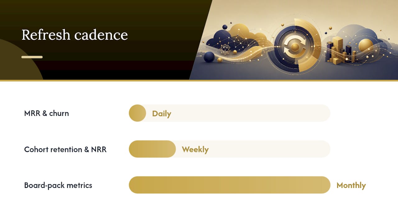
On cadence: MRR and churn belong on a daily refresh if your billing system supports it, cohort retention and NRR update fine weekly, and anything feeding a board pack should be locked and reconciled monthly, not pulled live the morning of the meeting.
What benchmarks should you set for unit economics?
Three ratios do most of the work in showing whether a SaaS business is efficient or just growing loudly. LTV:CAC compares customer lifetime value to acquisition cost; a ratio around 3x is widely treated as healthy, meaning you earn back three times what you spent to acquire a customer. CAC payback period measures how many months it takes to recover acquisition cost from gross margin; under 12 months is generally preferred, though capital-efficient businesses often target under six. The Rule of 40 adds revenue growth rate to profit margin (or free cash flow margin); a combined score of 40% or above signals a reasonable balance between growth and burn.
- LTV:CAC of 3x or higher: healthy unit economics
- LTV:CAC below 1x: acquisition cost exceeds lifetime value, an unsustainable position
- CAC payback under 12 months: preferred for most funding stages
- Rule of 40 at or above 40%: balanced growth and profitability
One nuance worth flagging: when calculating Rule of 40 for the dashboard, use year-on-year revenue growth rather than annualised month-on-month growth. Early-stage companies with small revenue bases can post wild month-on-month swings that make the Rule of 40 score meaningless if annualised naively.
For visualisation, gauges work well for ratios with a clear healthy threshold (LTV:CAC, Rule of 40), while trend lines suit CAC payback since the direction of travel matters as much as the absolute figure. RAG colouring on each tile, green above threshold, amber approaching it, red below, lets a board member scan five ratios in ten seconds rather than mentally benchmarking each one. Investors reading these numbers on a dashboard are typically checking one thing first: is the trend improving quarter over quarter, or is a strong current number masking a slow deterioration? Our detailed breakdown of CAC payback and how investors read growth efficiency goes further into what a breach in this metric usually signals operationally.
How do you make dashboards actually get used?
A dashboard nobody checks is a wasted integration. Ownership and cadence turn a report into an operational tool.
- Assign each KPI to a named owner, not a team. Revenue churn belongs to whoever runs customer success; CAC payback belongs to whoever controls the marketing budget.
- Set threshold alerts, not just anomaly flags. A churn spike of two standard deviations above baseline is worth a Slack alert; a single day’s dip in trial signups usually isn’t. Daily monitoring with alerting catches payment failures and churn spikes before they compound into a monthly trend nobody can explain.
- Fix a reporting cadence: daily automated checks for revenue and payment health, a weekly ops review of churn and pipeline, and a monthly board pack that’s locked, reconciled, and doesn’t change after distribution.
- Write a short escalation playbook for the scenarios that will actually happen. If MRR drops more than 5% month on month, the finance lead pulls the churn breakdown within 24 hours, checks for a single large account driving the number, and flags it to the founder before the board asks.
Pro Tip: The single biggest cause of alert fatigue is setting thresholds too tight in month one. Start wide, tighten gradually once you know what normal monthly variance actually looks like for your business.
How do you build a board-ready executive dashboard?
Start with the template anatomy: top row KPI tiles (MRR, ARR, NRR, churn), an MRR bridge showing the components of change, a churn breakdown by plan tier, a cohort retention snapshot, a unit-economics row, and a one-line insights panel.
- Reconcile billing data first. Nothing else matters until MRR ties out.
- Layer in cohort retention next, since it explains the churn number above it.
- Compute unit economics (LTV:CAC, CAC payback) once revenue and cost data are both clean.
- Add filters for plan tier, cohort age, and region, since a board will ask “is this driven by one segment?” more often than you’d expect.
- Export as a one-page PDF with RAG colouring intact, not a screenshot of a live dashboard that might change before the meeting.
Testing the layout on a synthetic dataset spanning 36 months before connecting production data lets you validate filters and benchmarks without risking a live number appearing wrong in front of a board.
How does a fractional CFO make your dashboard investor-ready?
A dashboard that looks polished but doesn’t reconcile to your accounts will unravel the first time an investor’s finance team asks a follow-up question. Governing metric definitions, and tying every dashboard figure back to the underlying financial model, is core to what a fractional CFO actually does.
- Maintain a metric definitions ledger so MRR, churn, and NRR mean the same thing in the dashboard, the model, and the board pack.
- Run reconciliation checks before every board cycle, not after a number gets challenged.
- Produce a one-page investor snapshot with commentary explaining the “why” behind each movement, not just the number itself.
- Translate operational metrics into the language investors actually use during diligence and valuation conversations.
A board pack that shows a different churn figure to the one in last quarter’s investor update is the fastest way to lose credibility in a raise. The fix isn’t a better chart, it’s a governed definition that everyone in the business, and everyone outside it, is working from the same base.
Led by ICAEW Chartered Accountant Kishen Patel, Consult EFC builds this governance layer directly into the fractional CFO engagements it runs for high-growth SaaS clients, standardising the metrics before they ever reach a board slide.
Why most SaaS dashboards fail before they’re even built
The conventional advice on SaaS dashboards obsesses over tools, which platform, which chart library, which connector. That’s the wrong starting point. The businesses that get this right treat governance as the actual product: a documented definition of churn, a reconciled MRR figure, a ledger that says exactly where each number comes from. Everything else, the gauges, the sparklines, the colour coding, is presentation layered on top of that foundation.
What’s overrated is dashboard sophistication for its own sake. A founder doesn’t need twelve tiles; they need five numbers they trust completely and a churn breakdown that explains the one that moved. What’s underrated is the discipline of writing down a metric’s formula once and enforcing it everywhere, because that single habit prevents almost every credibility problem I’ve seen surface in front of a board or an investor.
If you’re prioritising one thing first, make it reconciliation, not visualisation. A plain table of numbers that ties out beats a beautiful dashboard that doesn’t, every time it matters.
Frequently asked questions
What is the single most important KPI on a SaaS dashboard? Net Revenue Retention (NRR) tends to carry the most weight, since it shows whether your existing customer base is growing or shrinking independent of new sales, and it’s usually the first number investors check.
How often should a SaaS metrics dashboard refresh? Revenue and churn figures work best on a daily automated refresh, cohort and retention views suit a weekly update, and anything destined for a board pack should be locked and reconciled monthly.
What’s a healthy LTV:CAC ratio for a SaaS business? Around 3x is broadly considered healthy.
Can I build a KPI reporting tool with spreadsheets before investing in BI software? Yes, spreadsheet templates are a reasonable starting point for early-stage teams, but plan a migration to governed BI once ARR approaches roughly £1 million, when manual reconciliation typically becomes unmanageable.
How does a fractional CFO help with SaaS dashboard governance? A fractional CFO like those at Consult EFC standardises metric definitions, reconciles dashboard figures to the finance model, and prepares board-ready commentary so investors see consistent numbers across every report they’re given.
Sources
- SaaS-KPI-Dashboard (example implementation)
- Your SaaS metrics dashboard, reconciled to billing | Definite
- Free SaaS KPI dashboard template (Excel, Google Sheets)
Recommended
- Financial KPIs for SaaS companies: the founder’s guide
- SaaS Financial Benchmarks 2026: Gross Margin, CAC Payback, Churn
- Investor-Ready SaaS Metrics 2026: The Founder’s Reporting Guide
- SaaS Financial Due Diligence: Key Metrics to Prove
Not sure where your business stands right now?
Book a free 30-minute call with Kish. Bring your numbers, your questions, or just your situation. You will leave with a clearer picture than you arrived with.
Book a Free Strategy Call
Over 12 years across Big Four audit, Investment Banking, and corporate advisory. Kish works with SaaS founders, tech companies, and ambitious UK SMEs from £1M to £50M in revenue on fundraising, valuations, exit planning, and financial strategy. ICAEW regulated. Big Four trained. Based in London.